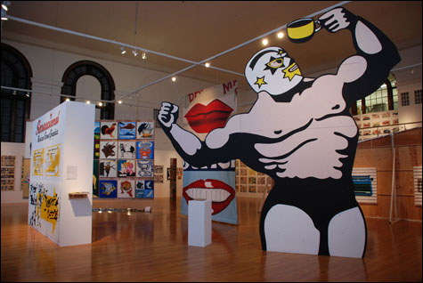
FUNHOUSE: Find the gallery scene lacking in pictures of R2-D2 serving pizza? This is the show for
you.
|
“¡Sensacional! Mexican Street Graphics,” the new exhibit at Massachusetts College of Art’s Paine Gallery, is a funhouse of brilliantly clunky handmade Mexican street art. If you find the gallery scene lacking in pictures of gremlins eating ice cream, masked Lucha Libre wrestlers, and R2-D2 serving pizza, this is the show for you.
A wrestler pictured on a little advertising card from a joint called Cafeteria el Cuadrilatero (the Ring Coffeeshop) becomes a looming 20-foot-high cutout. A tunnel built in the middle of the gallery is painted with scripts and blocky lettering that shout at you from all sides. A tourism-board banner features a topless yellow mermaid sitting on a rock with her head thrown back in ecstasy. She remains, however, composed enough to hold a pair of wine glasses on a platter. A sun poised on the watery horizon ogles her bust. The banner’s slogan: “Mexico: Beyond your expectations.”
Organized by Mexico City’s Trilce Ediciones publishers and San Francisco’s Yerba Buena Center for the Arts, “¡Sensacional!” is thrillingly crude, crass, colorful, jury-rigged, do-it-yourself, joky, humble, and in bad taste. It is about ingenious responses to limited resources. It surveys the advertising imagery on walls, awnings, posters, and handbills across Mexico in all their funky glory.
“Now that ‘perfect’ design is possible with the click of a mouse, the industrialized world has become nostalgic for ‘imperfect’ design,” former Talking Heads frontman David Byrne astutely observes in the catalogue (2002 Princeton Architectural Press, out of print). “As computer-aided everything takes over our lives we begin to realize, little by little, what is missing from the high-tech world. We realize that a crooked line sometimes has more soul than a perfectly straight one.”
In this sense, the exhibit, like much of our contemporary art, is concerned about our ever more artificially flavored and technologically manipulated world. We live in a nervous era, one that embraces the promise and fears the threat of stem cells, the Internet, smart bombs, and bio-engineered food. Some wary artists have responded with defiantly handmade work, insisting that in our flaws we are most fully and beautifully human.
MassArt exhibitions director Lisa Tung and her assistant Chloe Zaug have been presenting some of the liveliest exhibitions in the region — Mass Art alum Sam Durant, Carrie Mae Weems, the trend-mapping group show “Crafty,” Shintaro Miyake’s “The Beaver Project.” Not that I loved everything about those exhibits, but they exemplify the gallery’s risk taking, its diversity, its tasty blend of seriousness and fun.
The organizers of “¡Sensacional!” faced a major hurdle: how to exhibit street advertisements painted on walls or awnings and thus not easily brought into a gallery. Their solution is novel: a mix of hand-painted and photographic reproductions, small documentary photos of originals, and some original posters and fliers. Something is lost by relying so heavily on reproductions, but by hiring the rotulistas (sign painters) who make these sorts of street signs to paint copies on wood, canvas, and cloth, the curators capture the feel of the originals. (The copies might — if one were so inclined — bring up postmoderny questions about the nature of originality.)
The artwork is grouped by subject: food, auto parts, copyright-infringing cartoon characters, scantily clad mamacitas (hot chicks) strutting their stuff, animals, burlesque shows, fancy ladies advertising the work of beauty salons, creepy Michael Jacksons. School study-guide posters explain male and female reproductive anatomy, drug addiction, laboratory tools, and historical events. Lucha Libre masked-wrestling posters are mostly text in two or three colors peppered with a few stock wrestler images. Shops are represented by icons of their trade or wares: a padlock, keys, wrench, tire, washing machine, watches, car seats, fan, vacuum, hot-water heater, refrigerator, blenders.
Three freestanding columns display enlarged color copies of lurid comic-book covers and the packaging of powders and soaps that promise to get men begging at your feet. A comic with a title roughly translated as “The Law of the Gun: Hot and Wild for Your Stud” features a gun-slinging cowboy, a busty woman falling out of her lace teddy as she grabs for a rifle, and a dog with a ruffled clown collar. Nearby hangs a giant Roy Lichtenstein–style painted banner reproducing a comic-book image of a suited guy beating up a woman. Throughout the show, gender roles lean toward the sexist, but no more than what you see in American liquor stores.
The images are divorced from their original context and purpose — which are vaguely documented in small photos running along the wall bases — to focus your attention on their graphic flair. The comic-book covers can be slick, but most of the artwork here ranges from functional to ham-handed. It has an alluring frankness and humor, especially when, say, salon beauties come out looking like bug-eyed aliens.