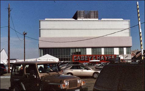
REAR ENTRY: Did the architects intend the ICA to turn its back on Boston? |
I waited in a crowd for two hours before finally getting into Boston’s new Institute of Contemporary Art on opening day, December 10. Just then a mother rushed out the door, telling her husband and their four little girls, “They say another hour.” One girl groaned, “Another hour? Arrggh!” Dad scowled, “This place better be amazing.”Most critics as well as most visitors I’ve spoken have called the new ICA just that. But I’ve had misgivings since I first visited last April, and three visits since the building was finished in December have only confirmed them. How do you embrace a building that turns its back on the city?
New York architects Diller Scofidio + Renfro take advantage of the South Boston waterfront site by orienting the new ICA toward the harbor. This is one of the building’s highlights as well as a great challenge for its use. They offer water views throughout. You can sit outside on a grandstand, under the cantilevered fourth-floor galleries, and look across the harbor walk to the water. When it works, it’s a calm, embracing shelter, but the massive cantilever puts it perpetually in shadow. I can’t help thinking of how Mr. Burns erected a contraption to block out the sun on The Simpsons. And for roughly half of each year Boston weather will make this windy, exposed spot inhospitable.

Many have praised the way the wood of the harbor walk continues up the grandstand stairway into the glass-walled ICA theater, turns up into the ceiling and then comes back out, sheathing the bottom of the cantilevered top floor. It’s a suave touch but an awful social metaphor: the stairway is a symbolic invitation into the privileged space of the museum, but any outsider who climbs it is halted by a glass wall.
A computer lab — the “Mediatheque” — hangs below the cantilevered galleries like the bridge of Star Trek’s Enterprise. From inside, the end wall is a window framing the harbor so that, unless you’re sitting in the first row, you see only rolling water — no horizon, no shore. It’s a great view on its own terms, but a dictatorial gesture that forces you to look a prescribed way.
Amid such design flourishes, the architects forgot that just about every visitor will approach the building from the land side. Or did they intend the ICA to turn its back on Boston? The building’s profile resembles a folded-up laptop computer (wow?), but the street façade could be any drab office building. At street level, the right half is a gray wall with a staff entrance and a loading dock, which I think in architect lingo is the building’s anus. The left half offers windows into an entrance hall, but you have to go around the side to enter. The doors are set so far back that the hall is mostly dead space. The design hustles you toward the admissions desk and the gift shop, ignoring a specially commissioned mural of a giant Japanese anime-style naked prepubescent girl farting.
Two big trends in avant-garde design are ignored: green building (a missed opportunity to be an environmental role model) and computer-age rococo (Frank Gehry’s MIT Stata Center, Daniel Libeskind’s Denver Art Museum, Santiago Calatrava’s Milwaukee Art Museum). And the architects ante up no new ideas instead. The overall tone is gray. The lighting tends toward gloomy. Raw concrete floors give the ICA a refurbished factory æsthetic, but one built from scratch for people who don’t want to get sullied by real refurbished factories. It’s desperately seeking to impress you with the brute force of its macho modernist “megatrusses” and 80-foot cantilever. This isn’t cutting-edge architecture, it’s butter-knife-edge architecture rehashing stuff people were building two or three generations ago.
A room-sized, glass-walled elevator (the glass had a four-foot crack during the first week) takes you to the fourth-floor galleries, offering water views on the way up. The signature characteristic of contemporary art is its diversity of styles, subjects, materials. The new ICA galleries could reflect that, offering tantalizing options and letting you to choose your own adventure. Instead you step off the elevator and a sign in the lobby directs you toward the main exhibit, chief curator Nicholas Baume’s “Super Vision,” in the west galleries. A door on other side offers only a blank wall.
“Super Vision” presents a couple of lovely pairings: Jeff Koons’s landmark 1986 stainless-steel cast of a dimestore inflatable Easter Rabbit (on opening day, there was a great first-floor sign warning visitors: “No touching of the art [this includes the bunny]”) with Anish Kapoor’s mesmerizing 1995 stainless-steel blob; James Turrell’s 1989 mysterious red void, New Light, with the computer-lab window. But on the whole this is a dull and timid premiere, with too few surprises and too many usual suspects — Gursky, Koons, Oursler, Polke, Richter, Ruscha. The works average 10 years old, and the ideas are even dustier. Chalk it up to opening-season jitters, but it’s a bad omen for a museum that bills itself as “audacious,” “fearless,” a forward-looking institution for the 21st century.